mytest


![]()
 UPDATES ON TWITTER: arudoudebito
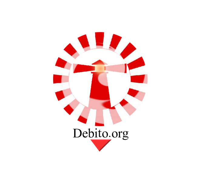
Hi Blog. Last week I put out a call for anyone to submit a logo for Debito.org’s upcoming iTunes podcast RSS Feed. Thanks for all the submissions, everyone, especially on such short notice. Here are the best ones:
Submitted by Manule:
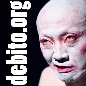
From Kaoru:
(A quick note on this one: I know Kaoru is a big fan of Noh, but I face a “Culture of No” every day when dealing with bureaucrats and stoneheads in Japan, and didn’t quite want the “Oh Noh, it’s Debito.org!” feeling behind this, sorry 
From Jarod Trebas:
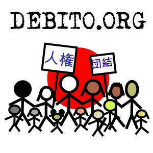
Honorable Mention, my favorite version submitted by Chris Bartlett:
This one in particular encapsulates the themes of people of any race or color being part of Japan and asking for human rights and solidarity. Like it a whole lot, and would like to use it somewhere else in future.
And the winner is…
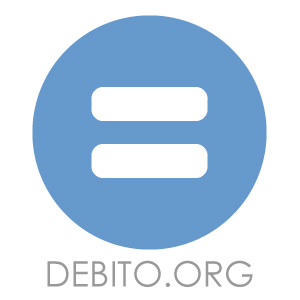
Jarod Trebas’ alternate version:
The reason I chose this one was because of 1) the Rising Sun emblem on white (Japan is a circle and all that), 2) the theme of equality within Japan being the fundamental essence of Debito.org, and 3) the font matching the motif of circles and maruku naru etc. It’s also very, very simple and to the point, in the best traditions of Japanese minimalist art styles. Thanks very much, Jarod. If you’d like to promote something on Debito.org, let me know.
Thanks to everyone who submitted! The podcast feed has been submitted and is pending iTunes approval. Arudou Debito in Sapporo
UPDATE NOVEMBER 19, 2009. iTunes has approved the DEBITO.ORG Podcast. Do go and subscribe (search term: Arudou Debito). I’ve got almost all my past podcasts up there already!

17 comments on “DEBITO.ORG RSS Feed Logo Contest Winner is Jarod Trebas”
Great artwork and ideas all ’round.
Kaoru’s entry features butō, not nō. Glad you went with the simple one, though: much better choice!
— Sorry about that. Shows you how much I Noh!
Yeah, the guy is butoh artist (Tenmetsu), but butoh has its roots in Noh, and I thought the idea of a symbol of traditional Japan rolling its eyes would be appropriate in a tongue-in-cheek way. Wasn’t meant as a serious entry, but sadly didn’t have the time to put together a proper one. I do like the simplicity of Jarad’s entry and think that’s a good choice!
You may also want to change your favicon to this logo.
Thank you for selecting my logo! I’m just glad to help the site out!
The best logo won. Very nice design, Jarod.
Great logo!
I prefer Chris Bartlett’s logo. It may not be minimalist, but there is no room for misconjection in what Debito stands for in Chris’s lovely, simple picture. And I, personally, think it better suits the overall feeling of Debito.org, which to me is upfront, accessible, and friendly.
Well done, Chris.
Have to say, I love Chris Bartlett’s design too. I hope it gets featured somewhere.
All the best
ben
The design may be nice, but I think I may have been able to decode a possible hidden message…
You see, the red dot at the center–the rising sun–is circular. Like the wheel of time in tarot, circle is also a symbol of equality, as it will always appear the same no matter which side you make it face upward. On the other hand, the equal sign (“=”) is not; in fact, a clear division can be seen between the line on the top, and the line at the bottom. This symbol may at first appear as meaning “equality in Japan,” but it may have a secret definition: disrupting Japan and engraving it with a social system that divides the nation into those above (NJs and other minorities) and those below (ordinary Japanese). Hear hear!
— My, some people will overread, won’t they. The Debito DaVinci Code.
It is an interesting logo.
Back stateside, the theme of equality has been picked up by the people looking for fair treatment and equal recognition of gay marriage.
For example, Garden State Equality in New Jersey – http://www.gardenstateequality.org/
I knew I had seen the white equals sign someplace else on the theme of civil rights.
It reminds me a little bit of a button or an electric socket.
— I thought of that. The equals-sign would be vertical if so.
Plus, a bit like the symbol for Kyoraku, per this 15 second commercial:
http://www.youtube.com/watch?v=51IKhqcEMfw
Glad you liked mine, but I would have voted for the one you chose too Debito, I agree the clever minimalist nature is very slick, excellent, well done Jarod!
Thanks to those who said they liked, mine, perhaps its a bit busy for a 300 x 300 let alone a 144 x 144 size, I’ll be supplying Debito with a high res version just in case he wants to use it for any other purposes.
I think mine might be used better where you are trying to attract people who dont know what debito.org is about, whereas Jarod’s logo is a great one people to rally around once they know what its all about as I suspect most people searching gout the pod casts will do.
(Please view the video link before you decide to post this. If you choose not to that’s OK too. Just an idea I had.)
Debito, I like the new logo. Very succinct. As a corollary, I happened upon this You-Tube video linked below, with a similar logo, advocating gay marriage. While I have no thoughts on this one way or the other, I was wondering if you’d ask your technically savvy readers to make a similar uploadable video using your new logo, or maybe two, even in English and Japanese, stating or encapsulating the causes you’re championing in a simple, poignant, and striking manner. I was hoping for something even the dreaded ‘Blaring Black Van People’ might even look at and say, “Hey, that’s reasonable.” (That would be an eventual point of arrival, and be a very long shot, I realize.) Might be worth a shot? Over to you.
http://www.youtube.com/watch?v=lxxtG9aAQ4o
If it was vertical, it would be a pause button. Not sure what that would symbolise
One of those kids is a mouse.
I’m just saying…
Manule’s is great, too!